Zeabur Website
Explained pricing with a simulated bill, and rebuilt the landing page as the target users changed
- 2024.03 – 2025.03
- Design Engineer
Zeabur (pronounced /ˈziːˌbər/) is a PaaS that lets developers deploy frontends, backends and databases in one click. As the sole designer on a small, fast-shipping startup team, I owned the interface, design system and brand visuals across the dashboard and website, and shipped components and pages directly in frontend code.
The website covers product introduction, pricing plans and the template marketplace. I led the redesign of the pricing and landing pages and built the dedicated referral page from scratch, contributing 189 non-merge commits to the website repository and shipping both the landing and referral pages directly in frontend code.
Pricing page
Zeabur's developer plan charges a $5 monthly subscription that includes $5 of monthly usage credit, with any overage billed pay-as-you-go. The previous pricing page explained this rule using only a text paragraph and a “Free amount” callout, leaving many users under the impression that usage was billed on top of the subscription fee and generating daily billing support tickets.
Prose alone struggles to convey tiered credit offsets intuitively. I restructured the core of the pricing page into an interactive simulated bill: a stepped line represents increasing usage, allowing users to scrub across usage levels and inspect the exact breakdown between subscription credit and overage charges in real time. After launch, support tickets regarding billing rules dropped to zero.
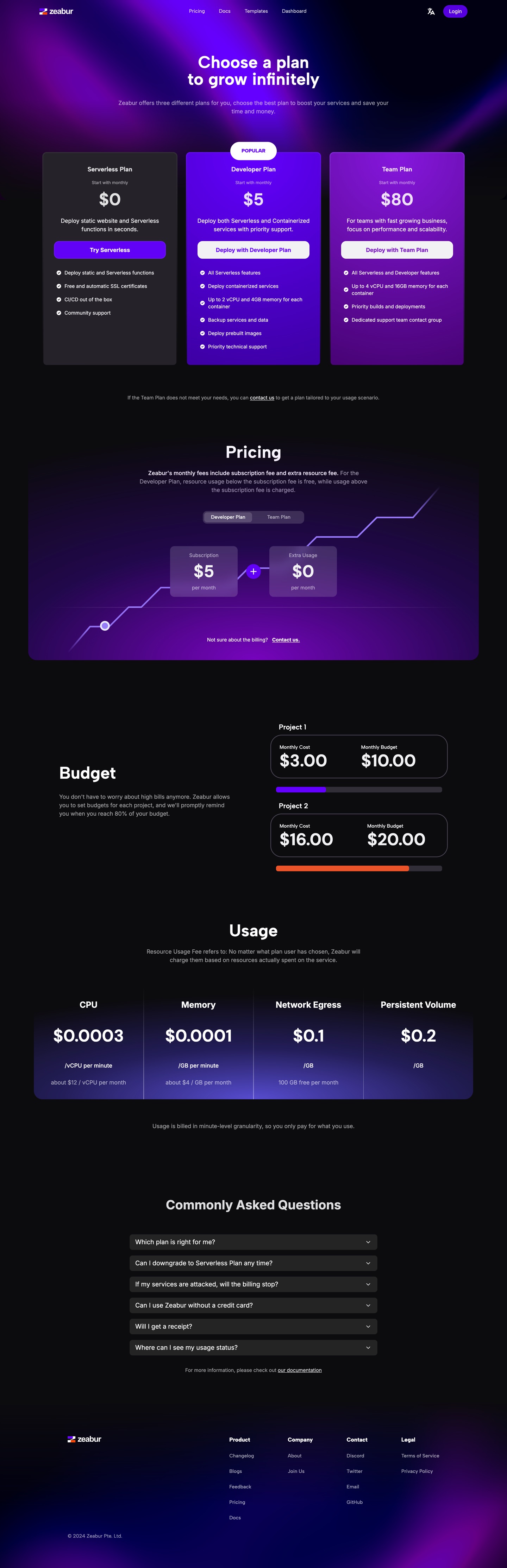
The old version explains the rule in prose, while the simulated bill gives the exact amount at every level of usage; switching preserves relative scroll position
Landing page
As Zeabur expanded its audience from traditional full-stack developers to AI-assisted builders, the existing landing page no longer reflected the product's positioning, and newly launched capabilities such as bring-your-own server and managed VPS lacked dedicated space.
Below the hero, the redesigned landing page introduces entry points for Cursor, GitHub Copilot and LLM deployments alongside a drag-and-drop zone for deploying local project folders directly. Core workflow sections—from git push and automatic framework detection to going live—retained their information architecture while receiving new isometric visuals and state transitions.
Static mockups rarely capture complex motion timing or responsive behavior across breakpoints accurately. For this redesign, I designed and built directly in code, tuning choreography, line wraps and layouts across viewports in the browser.

The full landing page before and after the redesign; switching preserves scroll position in proportion to page length
Referral page
Previously, referral links pointed to the website home page with only a small corner toast mentioning the inviter, which linked to a standard sign-in page where the reward terms were entirely absent.
I designed and built a dedicated referral landing page: the hero highlights the mutual $5 credit incentive alongside the sign-up action, while reusing core product feature modules below so invited users can evaluate the platform and complete registration in a single continuous flow.
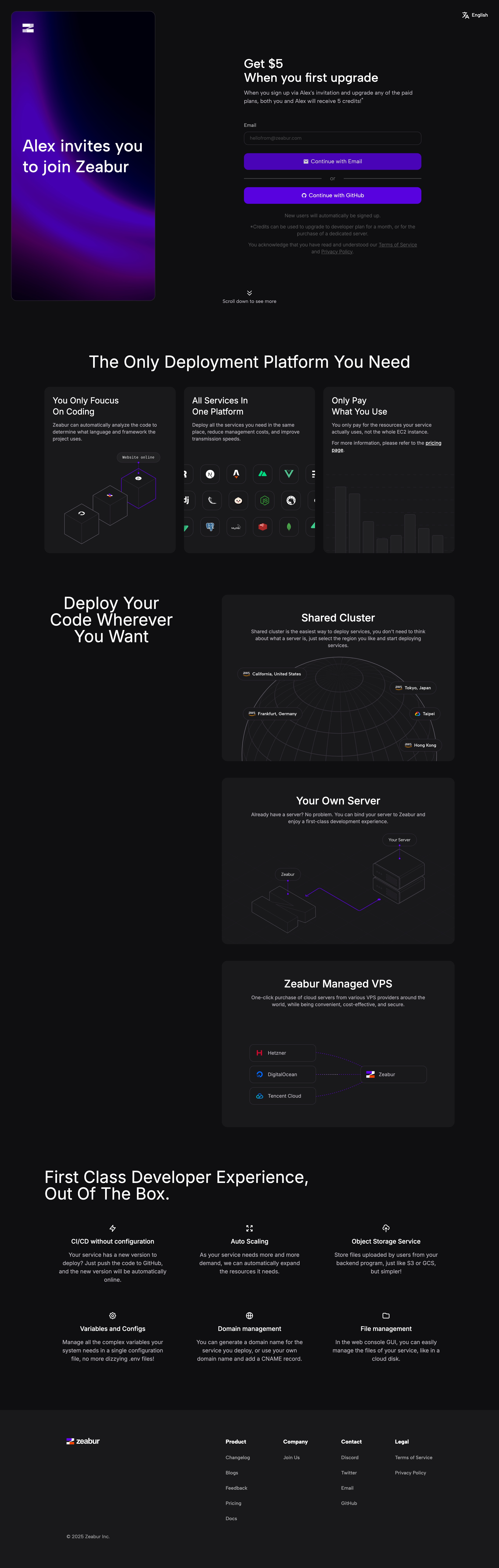
The hero leads with the $5 credit, and scrolling down introduces the platform's features; the inviter is sample data